Before moving into SwiftUI implementation, I conducted a usability test on the high-fidelity prototypes using Maze. This acted as a "control gate" to ensure that the core architecture, specifically the transition from a functional tool to an aesthetic memory, was intuitive.
Due to the constraints of the testing environment (8-block limit on the free plan), I strategically prioritized testing three foundational flows:
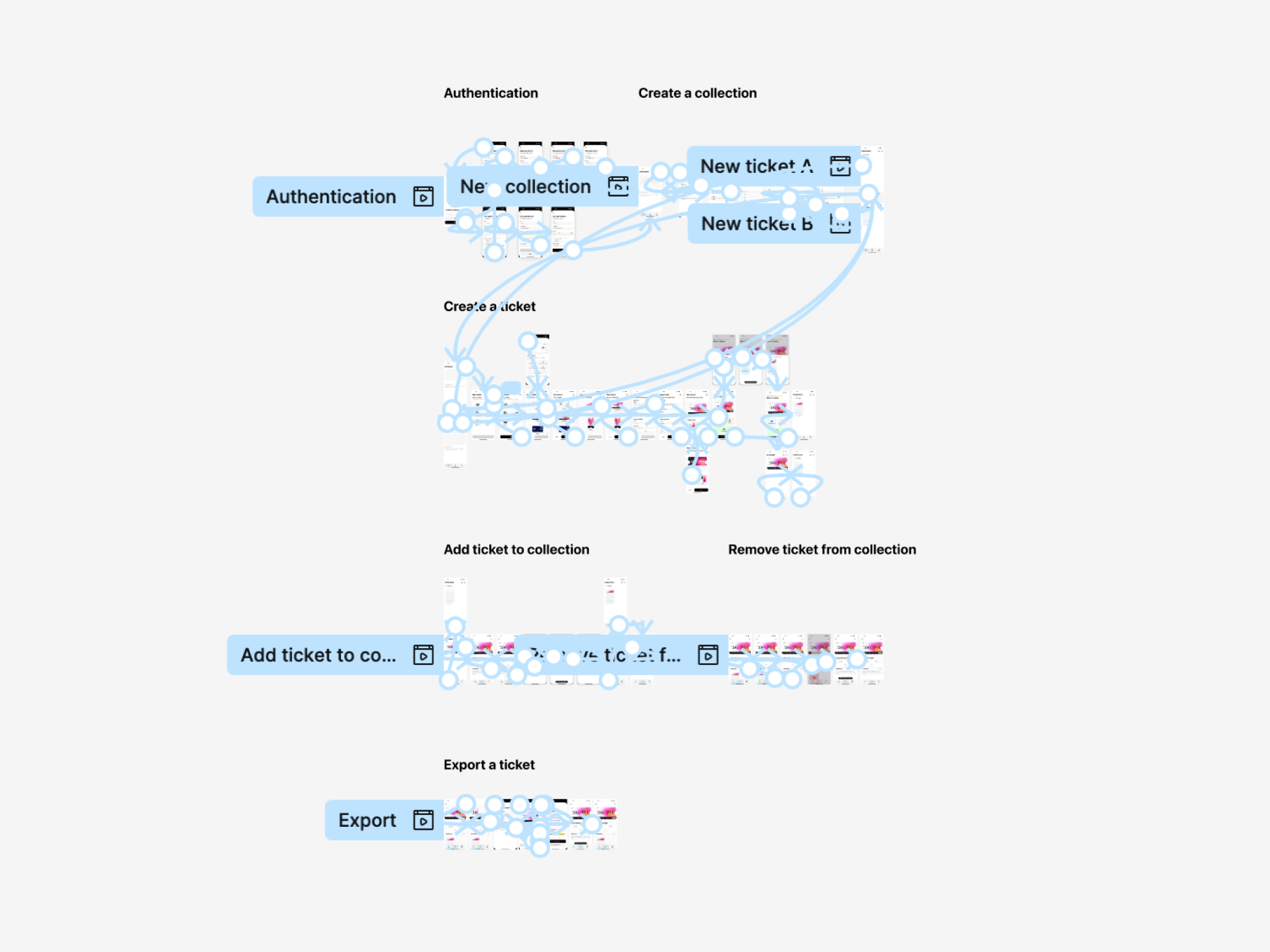
- Authentication
The entry point of the app.
- **Collection Creation
**Testing the mental model, since research showed users struggle with organization, I needed to see if "Creating a Trip" felt like a natural first step before making a ticket.
- **Ticket Creation
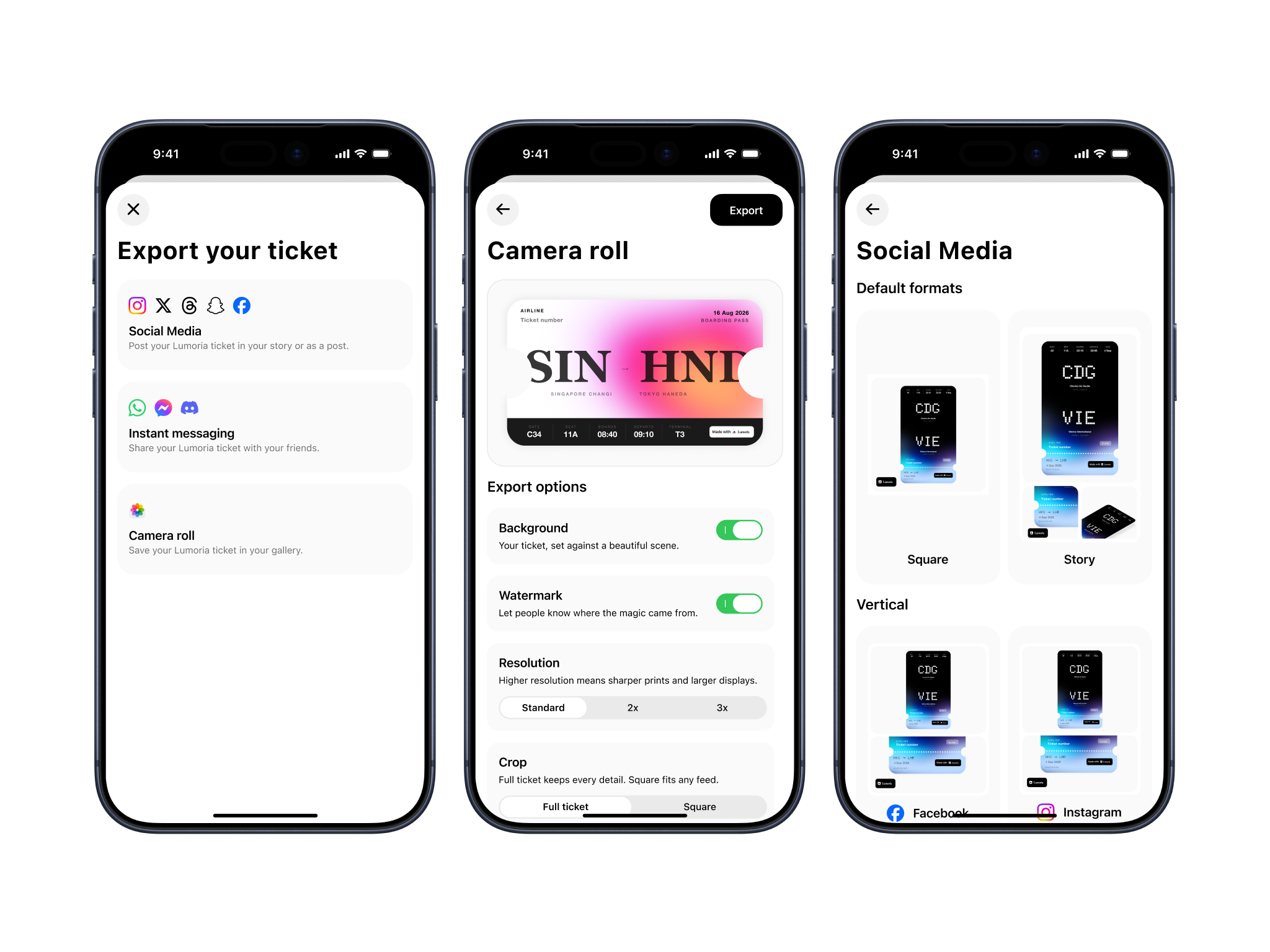
**The core value, this tested the linear 6-step funnel against the user's desire for speed and "aesthetic-first" results.
The test is still running as I am writing these lines. The current direction seems that the prototype is easy to use, with an average usability score of 4.6 (5 meaning that the prototype felt natural and straightforward). The comments suggest that users were frustrated by the “rigid” test, they could not tap where they wanted and expect it to work. They went down a predefined path. Arguably, this is not the best user test I could possibly come up with, I just had to trade spending extra time on the user test vs. moving faster onto implementation, as I know that it will be a lengthy process.
This phase confirmed that the design was ready for build. A second, more rigorous control gate, the Beta test, is scheduled for May 2026 to test these flows under real-world conditions (actual travel, varying data quality, and export behavior). I will be updating this section with more data as the beta goes live.